IBM Cloud UX Design
Problem
There is an existing form on a separate website that IBMers use to request an IBM Cloud promo code for an event (conference workshop, hackathon, etc). This website will be sunset at the end of the year and this form needs to be moved to IBM Cloud.
Scope
Updating the site homepage to reflect Cloud PAL's next step while still encouraging teams to think like a platform and creating consistent, delightful experiences for Public Cloud.
Role
Create new user flow
High fidelity designs
Process
Carbon Design System
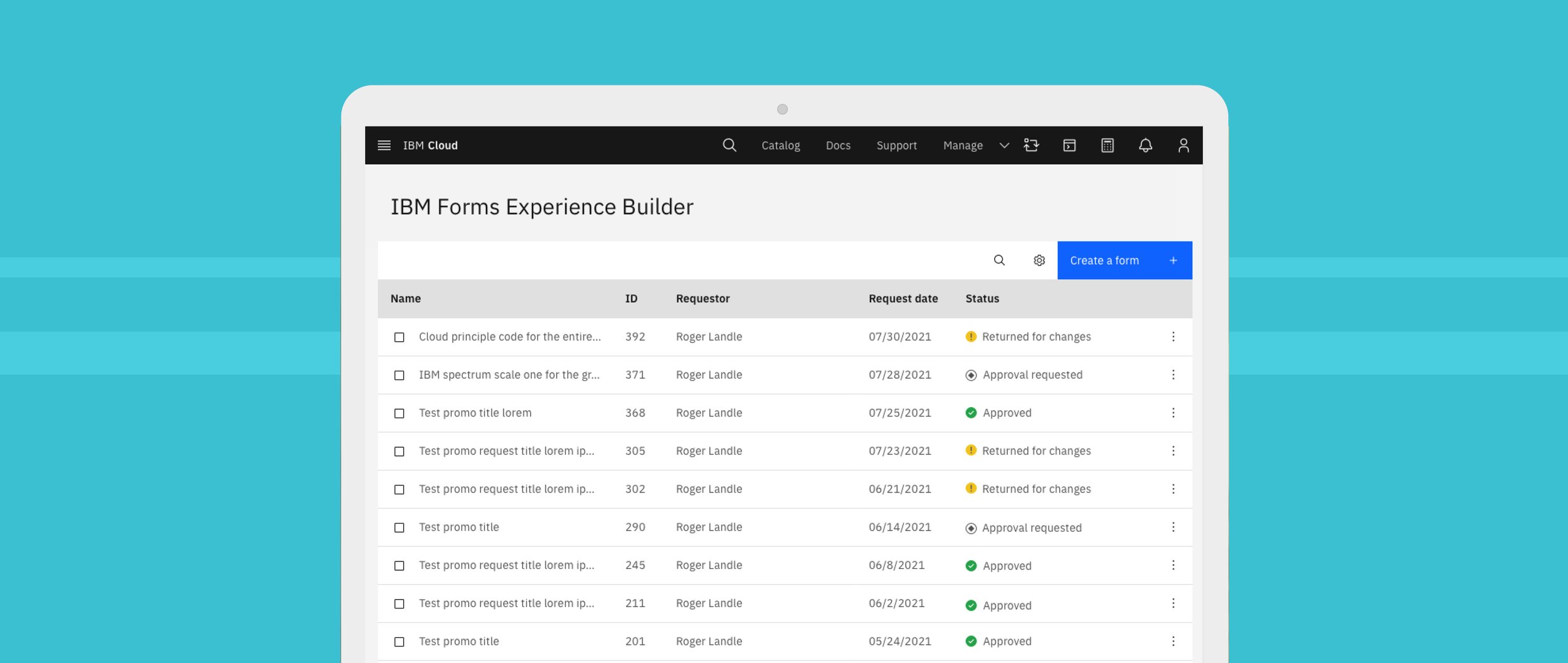
The form in it’s current state lacks hierarchy, organization, visual contrast and functionality. Through adopting the IBM Carbon Design system and applying the new user flow - clarity and usability was developed.

User flows
Process started with creating user flows for how we wanted the form submission and approval to function. This highlighted where the pain points where and the areas for improvement.
Key takeaways:
Unhelpful groupings of information for both approvers and requestors.
Too many form fields being displayed at once made the submission process feel overwhelming.
No clear intention to the user of what the forms main function was.
All users (approvers and requestors) were receiving the same form fields and information. Limited information was custom to each specific use-case.
Overall UI appeal is bland and lacks contrast.

Personas
There are two main users for this form: requestors and approvers.
Requestor’s main actions:
Submit a promo code request form
Review notes and make edits to a request form previously submitted
Request an extension for an existing form (optional)

Approver’s main action:
Review a promo code request form
Approve it or send it back to the requestor with notes
Carbon Design System
The form in its current state lacks hierarchy, organization, visual contrast and functionality. Through adopting the IBM Carbon Design system and applying the new user flow - clarity and usability was developed.